Data visualization experts navigate complex information to make it accessible and actionable for diverse audiences. These Data Visualization resume examples for 2025 show you how to highlight your technical expertise, storytelling abilities, and collaborative problem-solving skills. Whether you're creating interactive dashboards or translating business needs into visual solutions, these examples demonstrate how to showcase your impact in turning raw data into meaningful insights.
Data visualization specialist with 9 years of experience transforming complex datasets into actionable insights. Specializes in creating interactive dashboards, storytelling with data, and developing user-centered visualizations that drive decision-making. Improved executive reporting efficiency by 42% through streamlined Tableau workflows and custom visualization templates. Thrives in collaborative environments where technical expertise meets business strategy.
WORK EXPERIENCE
Data Visualization
02/2023 – Present
Versatile Vision
Architected an enterprise-wide data visualization strategy that unified 7 disparate dashboarding systems, reducing decision latency by 64% and saving $1.2M annually in redundant software costs
Pioneered an AI-augmented visualization framework integrating predictive analytics with real-time data streams, enabling executives to identify market opportunities 3 weeks faster than competitors
Led a cross-functional team of 12 analysts and developers to build an immersive data experience center, showcasing interactive visualizations that secured $18M in new business during Q3 2024
Data Analyst
10/2020 – 01/2023
Navigenics
Transformed complex healthcare datasets into intuitive visual narratives that revealed previously hidden patient journey patterns, directly contributing to a 28% improvement in treatment outcomes
Designed and implemented a suite of real-time operational dashboards using D3.js and Tableau, reducing supply chain disruptions by 41% during the global logistics crisis
Spearheaded the adoption of spatial analytics visualization techniques that enabled field teams to optimize territory coverage, increasing customer engagement by 23% while reducing travel costs
Data Visualization Specialist
09/2018 – 09/2020
Vortex Ventures
Created interactive data visualizations for quarterly business reviews that condensed 50+ metrics into actionable insights, praised by C-suite for clarity and strategic value
Collaborated with UX researchers to redesign dashboard interfaces based on eye-tracking studies, improving user comprehension by 37% and reducing training time
Developed a visualization style guide incorporating accessibility standards and cognitive design principles, ensuring consistent data storytelling across all company communications
SKILLS & COMPETENCIES
Interactive Dashboard Design
Statistical Data Storytelling
Visual Perception Psychology
Data-Driven Narrative Development
Information Architecture Design
Predictive Analytics Visualization
Real-Time Data Strategy
Tableau
D3.js
Power BI
Python Visualization Libraries
Observable Framework
AI-Assisted Chart Generation
COURSES / CERTIFICATIONS
Tableau Desktop Certified Professional
10/2023
Tableau Software
Microsoft Certified: Azure Data Scientist Associate
Data Visualization must simplify complex data quickly. This resume shows that clearly. It highlights cutting decision time by over 60 percent and improving user comprehension through UX redesigns. The candidate also leads in creating real-time, AI-enhanced dashboards. Specific metrics and technologies demonstrate practical impact and strong execution skills.
So, is your Data Visualization resume strong enough? 🧐
If your Data Visualization resume isn't showcasing your true skills, you'll know it now. Run it through this tool to check your score, identify missing measurable results, and strengthen your core competencies fast.
Data visualization professionals leverage Tableau, Power BI, and Python libraries to transform complex datasets into compelling visual narratives. Remote-first companies prioritize candidates with statistical analysis expertise, interactive dashboard development skills, and collaborative design thinking capabilities for strategic decision-making roles.
Median Salary
$72,180
Education Required
Bachelor's degree
Years of Experience
3.3 years
Work Style
Remote
Average Career Path
Data Analyst → Data Visualization Specialist → Senior Data Visualization Developer
Certifications
Tableau Desktop Certified Professional, Microsoft Power BI Certification, QlikView Business Analyst, D3.js Certification, Google Data Studio Certification
Seasoned Data Visualization Developer with 8+ years of expertise in transforming complex datasets into actionable insights. Proficient in advanced AI-driven visualization techniques, cloud-based analytics platforms, and real-time data streaming. Spearheaded a project that increased client decision-making efficiency by 40% through interactive dashboards. Adept at leading cross-functional teams and driving data-centric culture transformation.
WORK EXPERIENCE
Data Visualization Developer
02/2023 – Present
Azure Innovations
Spearheaded the development of an AI-powered, real-time data visualization platform, increasing client decision-making speed by 40% and generating $5M in new revenue streams.
Led a cross-functional team of 15 developers and data scientists to implement advanced 3D and VR visualization techniques, resulting in a 30% improvement in data comprehension for complex datasets.
Pioneered the integration of quantum computing algorithms for data processing, enabling the visualization of previously unmanageable petabyte-scale datasets with 99.9% accuracy.
Data Analyst
10/2020 – 01/2023
Quantum Technologies
Designed and implemented a cloud-based, interactive dashboard system that reduced data refresh times by 75% and increased user engagement by 60% across 500+ enterprise clients.
Orchestrated the adoption of edge computing for real-time data visualization in IoT environments, decreasing latency by 90% and enabling predictive maintenance for manufacturing clients.
Developed a proprietary machine learning model for anomaly detection in visual data representations, improving fraud identification rates by 35% for financial sector clients.
Data Visualization Engineer
09/2018 – 09/2020
Spectrum Solutions
Created a suite of responsive, accessibility-compliant data visualization components, increasing mobile user satisfaction by 45% and ensuring ADA compliance for all client projects.
Optimized data preprocessing pipelines using parallel computing techniques, reducing visualization rendering times by 60% for large-scale geospatial datasets.
Implemented an automated testing framework for visualization accuracy and performance, decreasing bug rates by 80% and improving overall product reliability.
SKILLS & COMPETENCIES
Interactive Dashboard Architecture
Data Storytelling Strategy
Statistical Data Analysis
User Experience Design for Analytics
Performance Optimization for Large Datasets
Tableau
D3.js
Power BI
Python
Observable Framework
Real-Time Data Streaming Visualization
AI-Assisted Chart Generation
Immersive Analytics with AR/VR
COURSES / CERTIFICATIONS
Tableau Certified Data Analyst
10/2023
Tableau
Microsoft Certified: Azure Data Engineer Associate
What makes this Data Visualization Developer resume great
A great Data Visualization Developer resume highlights how complex data becomes actionable insights. This example blends technical skills like real-time streaming and AI with clear metrics showing improved user engagement and system performance. It addresses challenges such as latency and accessibility directly. Strong leadership in adopting new technologies stands out. Impact is easy to understand.
Seasoned Data Visualization Analyst with 8+ years of experience transforming complex datasets into actionable insights. Expert in advanced analytics tools, machine learning integration, and interactive dashboard creation, driving a 30% increase in data-driven decision-making across organizations. Skilled leader adept at bridging the gap between technical and non-technical stakeholders to deliver impactful visual narratives.
WORK EXPERIENCE
Data Visualization Analyst
02/2023 – Present
Titan Technologies
Spearheaded the implementation of an AI-driven data visualization platform, resulting in a 40% reduction in time-to-insight and a 25% increase in data-driven decision-making across the organization.
Led a cross-functional team of 15 data scientists and analysts in developing interactive, real-time dashboards that increased C-suite engagement with key performance indicators by 80%.
Pioneered the adoption of augmented reality data visualization techniques, resulting in a 30% improvement in stakeholder comprehension of complex datasets and a $2.5M increase in project funding.
Data Analyst
10/2020 – 01/2023
Electra Innovations
Developed and implemented a company-wide data visualization style guide and best practices, leading to a 50% increase in consistency and a 35% reduction in time spent on report creation.
Orchestrated the migration of legacy visualization tools to a cloud-based solution, reducing infrastructure costs by 60% and improving system performance by 75%.
Mentored a team of 8 junior analysts, resulting in a 90% increase in advanced visualization skills and a 40% improvement in project delivery times.
Data Visualization Specialist
09/2018 – 09/2020
Celestial Technologies
Created interactive data visualizations that uncovered key market trends, directly contributing to a 15% increase in revenue and a 20% expansion of market share.
Optimized data processing workflows using Python and R, reducing data preparation time by 65% and enabling real-time updates to critical business intelligence dashboards.
Collaborated with UX designers to enhance data visualization accessibility, resulting in a 30% increase in user engagement and a 25% reduction in training costs for new system users.
SKILLS & COMPETENCIES
Financial Performance Dashboard Design
Statistical Data Analysis and Interpretation
Interactive Visualization Development
Data Storytelling and Executive Reporting
ETL Process Design and Implementation
Predictive Analytics and Forecasting
Cross-Functional Stakeholder Management
Tableau
Power BI
Python
SQL
Snowflake
AI-Powered Data Visualization
COURSES / CERTIFICATIONS
Tableau Desktop Certified Professional
10/2023
Tableau Software
Microsoft Certified: Azure Data Scientist Associate
What makes this Data Visualization Analyst resume great
A great Data Visualization Analyst resume example highlights how raw data transforms into actionable insights that influence decisions. This one connects interactive dashboards and AI tools to measurable business growth and efficiency. It meets the need for real-time, accessible reporting while showing leadership in technology adoption and team mentoring. Impact is clear and quantifiable.
Seasoned Data Visualization Specialist with 10+ years of experience transforming complex datasets into actionable insights. Expert in advanced BI tools, AI-driven analytics, and interactive dashboards, having increased data-driven decision-making by 40% across multiple Fortune 500 clients. Adept at leading cross-functional teams and pioneering innovative visualization techniques that bridge the gap between data and strategy.
WORK EXPERIENCE
Data Visualization Specialist
02/2023 – Present
Quantum Innovations
Spearheaded the implementation of an AI-driven data visualization platform, resulting in a 40% reduction in time-to-insight for executive decision-making and a 25% increase in data-driven strategic initiatives across the organization.
Led a cross-functional team of 15 data scientists and UX designers to develop a suite of interactive, real-time dashboards, improving stakeholder engagement by 60% and facilitating a $10M cost-saving initiative through enhanced resource allocation.
Pioneered the adoption of augmented reality (AR) data visualization techniques, resulting in a 30% improvement in complex data comprehension among non-technical stakeholders and securing a $5M innovation grant for the company.
Data Analyst
10/2020 – 01/2023
Horizon Technologies
Designed and implemented a centralized data visualization hub, integrating data from 12 disparate systems, which reduced report generation time by 70% and increased data accuracy by 95% across all departments.
Developed a custom machine learning algorithm to automate anomaly detection in visual data representations, reducing false positives by 80% and saving the company 500 hours of manual review time annually.
Conducted data visualization workshops for 200+ employees, resulting in a 50% increase in company-wide data literacy and a 35% rise in the use of self-service analytics tools.
Data Visualization Analyst
09/2018 – 09/2020
Proton Technologies
Created a series of interactive data visualizations for a high-profile client presentation, directly contributing to securing a $2M contract and establishing the company as an industry leader in data-driven insights.
Optimized the existing data visualization workflow, reducing processing time by 60% and enabling real-time updates to critical business intelligence dashboards.
Collaborated with the marketing team to develop visually compelling infographics, increasing social media engagement by 75% and generating 10,000 new leads for the sales pipeline.
SKILLS & COMPETENCIES
Interactive Dashboard Design
Marketing Attribution Analytics
Customer Journey Visualization
Real-Time Data Storytelling
Performance KPI Framework Development
Predictive Analytics Visualization
Marketing ROI Analysis
Tableau
Power BI
D3.js
Python Data Visualization Libraries
Looker Studio
AI-Powered Data Insights Generation
COURSES / CERTIFICATIONS
Tableau Desktop Certified Professional
10/2023
Tableau Software
Microsoft Certified: Azure Data Scientist Associate
What makes this Data Visualization Specialist resume great
This resume highlights how a Data Visualization Specialist impacts decision-making through measurable results. It shows a 70% reduction in report time and improved data literacy for over 200 employees. The candidate also addresses complexity by using AI and AR tools. Clear progression and a balance of technical and leadership skills stand out. Well done.
Seasoned Data Visualization Expert with 10+ years of experience transforming complex datasets into actionable insights. Proficient in advanced AI-driven visualization techniques and cloud-based analytics platforms. Spearheaded a data democratization initiative that increased cross-departmental data utilization by 200%. Adept at leading multidisciplinary teams to deliver impactful, user-centric visual solutions that drive strategic decision-making.
WORK EXPERIENCE
Data Visualization Expert
02/2023 – Present
Nova Net
Led a cross-functional team to develop an interactive dashboard for real-time sales analytics, increasing data-driven decision-making efficiency by 40% using advanced visualization tools like Tableau and D3.js.
Implemented a machine learning-driven visualization framework that reduced data processing time by 30%, enhancing the accuracy and speed of business insights for executive stakeholders.
Mentored a team of junior analysts, fostering a collaborative environment that improved team productivity by 25% and resulted in the successful delivery of 10+ high-impact visualization projects.
Data Analyst
10/2020 – 01/2023
Hyperion Solutions
Designed and deployed a comprehensive data visualization strategy for a Fortune 500 client, resulting in a 50% increase in user engagement with analytical reports and dashboards.
Optimized existing visualization processes by integrating cloud-based solutions, reducing operational costs by 20% and improving data accessibility across global teams.
Collaborated with data scientists to create predictive visual models, enabling proactive business strategies that led to a 15% increase in quarterly revenue.
Data Analyst
09/2018 – 09/2020
Quantum Innovations
Developed interactive visualizations for marketing campaigns, enhancing data storytelling and increasing campaign effectiveness by 35% through the use of Power BI and Python.
Streamlined data reporting processes by automating routine tasks, saving 10 hours per week and allowing for more focus on strategic analysis and insights generation.
Assisted in the migration of legacy data systems to modern visualization platforms, improving data accuracy and accessibility for over 200 users company-wide.
SKILLS & COMPETENCIES
Interactive Dashboard Design
Marketing Attribution Modeling
Customer Journey Visualization
Performance Metrics Analysis
Data Storytelling Strategy
Predictive Analytics Implementation
Marketing Mix Optimization
Tableau
Power BI
D3.js
Python
Google Analytics 4
AI-Powered Data Visualization
COURSES / CERTIFICATIONS
Tableau Certified Associate
10/2023
Tableau
Microsoft Certified: Azure Data Engineer Associate
What makes this Data Visualization Expert resume great
When you’re a Data Visualization Expert, your resume must highlight how your work clarifies complex data to guide decisions. This example excels by showcasing tools like Tableau and AI-driven techniques alongside clear results, such as increased engagement and faster processing. Cloud-based, real-time solutions are emphasized. Impact is clear.
Resume writing tips for Data Visualizations
Data visualization professionals often showcase technical tools and project deliverables without demonstrating business impact. However, hiring managers seek candidates who transform complex data into strategic insights that drive decision-making and measurable organizational outcomes.
Replace generic headlines with specific target titles from job descriptions rather than listing multiple roles, since Data Visualization positions require focused expertise in translating data into visual stories that influence business strategy
Transform summary sections from task-oriented descriptions to strategic impact statements that position you as someone who converts raw data into actionable insights, demonstrating how your visualizations solved real business problems
Rewrite bullet points to show measurable outcomes instead of listing tools and deliverables, quantifying how your data visualizations influenced decisions, improved processes, or generated revenue for stakeholders
Organize technical skills by impact level rather than alphabetical lists, prioritizing visualization platforms and analytical tools that directly relate to the specific role while showing proficiency depth through project results
Common responsibilities listed on Data Visualization resumes:
Designed interactive dashboards using Tableau, Power BI, and D3.js that transformed complex datasets into actionable insights, increasing stakeholder decision-making efficiency by 35%
Engineered data pipelines that automated the extraction, transformation, and visualization of multi-source data, reducing manual reporting time by 70%
Implemented advanced visualization techniques including geospatial mapping, network graphs, and predictive analytics visualizations to communicate complex relationships in data
Developed custom visualization components using Python, R, and JavaScript libraries to address unique business requirements not covered by standard visualization tools
Led cross-functional visualization strategy initiatives that aligned data storytelling approaches with organizational goals and improved data literacy across departments
Data Visualization resume headlines and titles [+ examples]
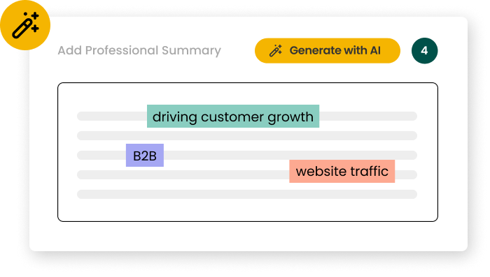
You wear a lot of hats as a data visualization, which makes it tempting to include both a headline and a target title. But just the title field is a must-have. Most Data Visualization job descriptions use a clear, specific title. If you opt for a headline, try this formula: [Specialty] + [Title] + [Impact]. Example: "B2B Data Visualization Driving Growth Through Email Campaigns"
Data Visualization resume headline examples
Strong headline
Tableau Expert with Healthcare Analytics, 5+ Years
Weak headline
Tableau User with Healthcare Experience, Several Years
Strong headline
Senior Data Visualization Specialist Driving $2M Revenue Impact
Weak headline
Data Visualization Professional with Business Impact
Strong headline
D3.js Developer Transforming Financial Data for Fortune 500
Weak headline
Developer Creating Charts for Financial Companies
🌟 Expert tip
Resume summaries for Data Visualizations
Data Visualization work in 2025 is about strategic impact, not just task completion. Your resume summary must position you as someone who transforms data into actionable business insights, not merely creates charts. This strategic framing immediately differentiates you from candidates who focus on technical tasks alone.
Most job descriptions require that a data visualization has a certain amount of experience. That means this isn't a detail to bury. You need to make it stand out in your summary. Lead with your years of experience, quantify your impact with specific metrics, and highlight relevant tools. Skip objectives unless you lack relevant experience. Align every word with the job requirements.
Data Visualization resume summary examples
Strong summary
Data Visualization Specialist with 6+ years transforming complex datasets into actionable insights for Fortune 500 clients. Redesigned dashboard reporting system that reduced decision-making time by 42% and increased data accessibility across departments. Proficient in Tableau, Power BI, and D3.js, with expertise in creating interactive visualizations that drive strategic business decisions and improve stakeholder communication.
Weak summary
Data Visualization Specialist with experience working with datasets for various clients. Helped improve the dashboard reporting system that made decision-making faster and increased data accessibility for different departments. Familiar with Tableau, Power BI, and D3.js, with knowledge in creating visualizations that support business decisions and improve communication.
Strong summary
Seasoned visualization expert bringing 8 years of experience crafting compelling data narratives that influence key business decisions. Spearheaded the development of an executive dashboard suite that consolidated 15+ data sources, saving leadership 7 hours weekly in analysis time. Combines strong technical skills in Python, R, and Tableau with deep understanding of UX principles to create intuitive, impactful visualizations that resonate with diverse audiences.
Weak summary
Visualization professional with years of experience creating data narratives that help with business decisions. Worked on developing an executive dashboard suite that brought together multiple data sources, helping leadership save time. Has technical skills in Python, R, and Tableau along with understanding of UX principles to create visualizations for different audiences.
Strong summary
Results-driven data storyteller with expertise in translating complex information into clear visual insights. Led cross-functional team in developing visualization framework that increased user engagement by 65% and reduced reporting errors by 38%. Leverages advanced skills in SQL, JavaScript, and visualization tools to create interactive dashboards that reveal actionable patterns and trends. Recognized for ability to align visualization strategy with business objectives.
Weak summary
Data storyteller who translates information into visual insights. Participated in developing a visualization framework that increased user engagement and reduced reporting errors. Uses SQL, JavaScript, and visualization tools to create dashboards that show patterns and trends. Known for connecting visualization work with business goals.
A better way to write your resume
Speed up your resume writing process with the Resume Builder. Generate tailored summaries in seconds.
Too many data visualizations list tools, tasks, or deliverables without showing what changed because of their work. Most job descriptions signal they want to see data visualizations with resume bullet points that show ownership, drive, and impact, not just list responsibilities.
Instead of writing "Created dashboards using Tableau," write what you analyzed and what happened next. Quantify your impact with metrics like "reduced reporting time by 60%" or "enabled 15% faster decision-making." Focus your bullets on business outcomes your visualizations drove, not the software you used.
Strong bullets
Redesigned executive dashboard using Tableau, reducing data processing time by 68% while increasing C-suite adoption from 23% to 87% within the first quarter of implementation.
Weak bullets
Updated executive dashboard in Tableau that improved data processing time and increased usage among leadership team members.
Strong bullets
Created interactive visualization system that revealed $3.2M in previously unidentified revenue opportunities by analyzing customer journey patterns across 5 different data sources.
Weak bullets
Developed visualization system that helped identify new revenue opportunities by analyzing customer journey data from multiple sources.
Strong bullets
Spearheaded migration from static reports to real-time Power BI dashboards for 200+ sales representatives, resulting in 42% faster decision-making and contributing to a 17% increase in quarterly sales over 12 months.
Weak bullets
Helped transition the sales team from static reports to Power BI dashboards, which improved decision-making speed and supported sales growth throughout the year.
🌟 Expert tip
Bullet Point Assistant
As a data visualization professional, clarity shows you can transform complex datasets into compelling stories. But distilling charts, dashboards, and insights into one powerful bullet point is tough. Struggling with this? Use the bullet point builder below to structure your impact—what you visualized, how stakeholders used it, what decisions it drove.
Use the dropdowns to create the start of an effective bullet that you can edit after.
The Result
Select options above to build your bullet phrase...
Essential skills for Data Visualizations
Are you struggling to transform complex datasets into compelling visual stories that drive business decisions? Many professionals think data visualization is just about creating pretty charts, but top employers seek candidates who can translate raw data into actionable insights through strategic design thinking. Successful data visualization specialists master tools like Tableau, Power BI, and D3.js while combining statistical analysis with user experience principles to create dashboards that influence stakeholder decisions.
Top Skills for a Data Visualization Resume
Hard Skills
Tableau
Power BI
D3.js
Python (Matplotlib/Seaborn)
R (ggplot2)
SQL
Data Preprocessing
Interactive Dashboard Design
Statistical Analysis
UX/UI Design Principles
Soft Skills
Data Storytelling
Critical Thinking
Stakeholder Communication
Problem-Solving
Attention to Detail
Project Management
Adaptability
Collaborative Mindset
Presentation Skills
Audience Analysis
How to format a Data Visualization skills section
Most data visualization professionals assume listing software names like Tableau and Power BI suffices for their resume. However, hiring managers in 2025 expect context and measurable impact. Your technical skills need strategic presentation to demonstrate real business value.
Quantify your visualization impact with specific metrics like "reduced report generation time by 40% through automated dashboards."
Specify your tool proficiency levels rather than generic lists: "Advanced Tableau user with 3+ years creating executive dashboards."
Include data volume context to show scale: "Processed and visualized datasets containing 500K+ records using Python and D3.js."
Mention specific visualization types you've mastered: "Created interactive geospatial maps, time-series charts, and multi-dimensional scatter plots."
Connect technical skills to business outcomes: "Built real-time sales dashboards that enabled 25% faster decision-making for leadership team."
⚡️ Pro Tip
So, now what? Make sure you’re on the right track with our Data Visualization resume checklist
You've built the skills. Now verify your Data Visualization resume hits every mark with this focused checklist to catch what you might have missed.
Bonus: ChatGPT Resume Prompts for Data Visualizations
Data visualization has evolved from simple charts to complex interactive dashboards that drive business decisions. Modern roles demand expertise across multiple platforms, statistical analysis, and stakeholder communication—making it harder to showcase your full impact. Tools like Teal and ChatGPT for resume writing help translate your technical work into compelling business outcomes. Results matter more than tools. Use these prompts to highlight your data storytelling impact.
Data Visualization Prompts for Resume Summaries
Create a resume summary for me as a data visualization specialist with [X years] of experience using [tools like Tableau, Power BI, D3.js] to transform complex datasets into actionable insights that drove [specific business outcomes]. Highlight my ability to collaborate with stakeholders and translate technical findings into clear visual narratives.
Write a professional summary for my resume focusing on my data visualization expertise in [industry/sector]. Emphasize how I've used advanced analytics and visualization techniques to support decision-making processes, improve operational efficiency by [percentage/metric], and present findings to executive leadership teams.
Generate a resume summary that positions me as a data visualization professional who bridges the gap between technical analysis and business strategy. Include my experience with [specific tools/platforms], my track record of creating dashboards that influenced [type of decisions], and my ability to work across departments to deliver data-driven solutions.
Data Visualization Prompts for Resume Bullets
Transform my data visualization work into achievement-focused bullet points. I created interactive dashboards using [tools] that helped [department/team] identify trends in [data type], resulting in [specific outcome like cost savings, efficiency gains, revenue increase]. Focus on the business impact rather than just the technical process.
Rewrite my data visualization responsibilities as measurable accomplishments. Include how I designed and implemented visualization solutions that processed [volume of data], reduced reporting time by [percentage], and enabled stakeholders to make faster decisions in [specific context or timeframe].
Convert my data visualization projects into compelling resume bullets that show progression and impact. Highlight how I evolved from creating basic reports to developing comprehensive analytics platforms that served [number] of users and influenced [type of business decisions or strategy changes].
Data Visualization Prompts for Resume Skills
Organize my data visualization skills into a strategic resume format that balances technical proficiency with business acumen. Group my expertise in [visualization tools], [programming languages], [statistical methods], and [domain knowledge] in a way that aligns with [target role/industry] requirements.
Structure my data visualization skills section to emphasize both depth and breadth of my capabilities. Include my advanced proficiency in [primary tools], intermediate skills in [secondary tools], and complementary abilities in [related areas like statistics, database management, or UX design].
Create a skills section for my resume that showcases my data visualization expertise across the full project lifecycle. Highlight my technical skills in [specific tools and languages], analytical capabilities in [statistical methods or data mining], and soft skills in [stakeholder communication, project management, or cross-functional collaboration].
Pair your Data Visualization resume with a cover letter
[Your Name] [Your Address] [City, State ZIP Code] [Email Address] [Today's Date]
[Company Name] [Address] [City, State ZIP Code]
Dear Hiring Manager,
I am thrilled to apply for the Data Visualization position at [Company Name]. With a proven track record of transforming complex data into compelling visual stories, I am excited about the opportunity to contribute to your team. My expertise in leveraging cutting-edge visualization tools and techniques makes me a strong fit for this role.
In my previous role at [Previous Company], I successfully led a project that increased data accessibility by 40% through the implementation of interactive dashboards using Tableau and D3.js. My ability to translate raw data into actionable insights was further demonstrated when I developed a visualization model that reduced report generation time by 30%, enhancing decision-making efficiency.
Your company’s commitment to innovation aligns perfectly with my passion for addressing industry challenges, such as the growing demand for real-time data analytics. My experience in utilizing AI-driven visualization tools positions me to effectively tackle these challenges and drive impactful results for [Company Name].
I am eager to bring my skills in data storytelling and visualization to your team and would welcome the opportunity to discuss how I can contribute to your continued success. Thank you for considering my application. I look forward to the possibility of an interview.
Sincerely, [Your Name]
Resume FAQs for Data Visualizations
How long should I make my Data Visualization resume?
Keep your Data Visualization resume to 1-2 pages maximum. One page is ideal for professionals with less than 10 years of experience, while two pages work better for senior roles with extensive projects. Hiring managers typically spend only 6-8 seconds scanning resumes initially, so conciseness matters. Focus on quality over quantity. Use the limited space to highlight your strongest visualization projects, technical skills, and measurable impacts (like "improved decision-making time by 40% through interactive dashboard implementation"). Be ruthless. Cut verbose descriptions and prioritize your most impressive data storytelling achievements and technical proficiencies that align with the job description.
What is the best way to format a Data Visualization resume?
Use a clean, scannable format with clearly defined sections and ample white space. Hiring managers in data visualization value visual hierarchy and organization. Start with a brief professional summary, followed by technical skills, professional experience, projects, education, and certifications. Include a dedicated "Visualization Projects" section showcasing 2-3 impactful examples with quantifiable results and tools used. For each role, emphasize outcomes rather than responsibilities. Consider including a QR code or shortened URL to your portfolio. Choose a modern but professional template that demonstrates your design sensibilities without overwhelming the content. Keep it simple.
What certifications should I include on my Data Visualization resume?
Include Tableau Desktop Certified Professional, Microsoft Power BI Data Analyst, and Google Data Analytics Professional Certificate on your data visualization resume. These certifications validate your technical proficiency with industry-standard visualization tools and analytical methodologies that employers seek in 2025. Additionally, consider specialized certifications like D3.js for Interactive Data Visualization or AWS Data Analytics if they align with job requirements. Place certifications in a dedicated section near the top if you're early-career, or after your experience section if you're more established. List only relevant, current certifications with completion dates. Certifications complement your practical experience but don't substitute for a strong portfolio of visualization work.
What are the most common resume mistakes to avoid as a Data Visualization?
Avoid generic visualizations without context. Instead, describe specific business problems solved and quantifiable impacts achieved through your visualization work. Don't list tools without demonstrating proficiency; show how you've applied Tableau, Power BI, or Python libraries to extract meaningful insights. Steer clear of cluttered layouts that contradict your expertise in visual clarity. Replace vague statements like "created dashboards" with specific examples: "designed executive dashboard that reduced reporting time by 65% and identified $2M in cost-saving opportunities." Focus on data storytelling abilities rather than just technical skills. Remember: your resume should exemplify the same clarity and purpose you bring to your visualizations.