

3 key takeaways
- Your resume font impacts readability and professionalism, and it can influence the overall look of your document.
- The type of font you choose for your resume depends on the industry you're applying in as well as several other factors.
- Teal's AI Resume Builder has flexible design with several professional font options.
Imagine having your resume dismissed because the font you chose was unreadable or gave off the wrong vibe for your industry.
Sound far-fetched? It’s not.
The font you choose for your resume isn’t just a stylistic decision—it can make or break whether the ATS can properly scan your resume and if a hiring manager or recruiter can actually read it. A good resume uses a font that’s both professional and easy to read, helping your content shine without distraction.
Below, you’ll learn how your resume font impacts readability and professionalism. You’ll also find the best resume font for your industry, along with tips and examples for choosing the right font and how to format it to ensure your design choices maximize how long hiring managers spend reading your resume by improving the overall presentation.
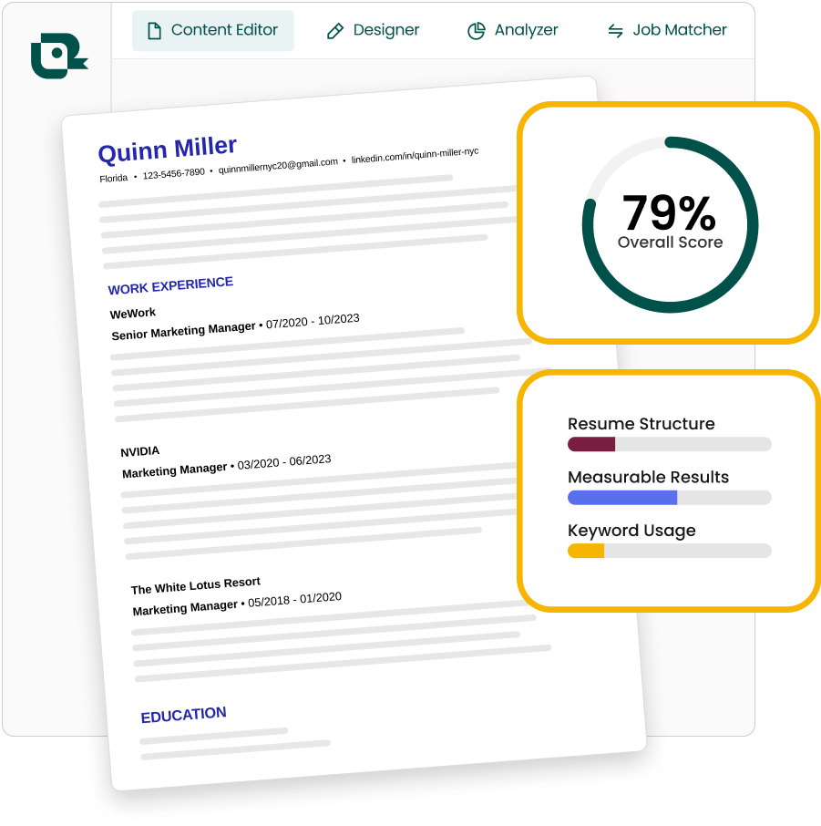
Want to make a resume with the best fonts for your industry (and the ATS) without manual formatting? Try Teal's AI Resume Builder.
Why is resume font important?
Your resume's font affects how employers perceive you. It impacts readability and professionalism, and it can influence the overall look of your document. Different fonts have different personalities, much like voices in a room. Some are bold, others are clean and modern, while a few appear more traditional.
Font choice is part of your communication style. It can help show what makes you unique. A good font ensures your qualifications and experience are clearly conveyed to recruiters and hiring managers.
What font should a resume be?
Like most resume formatting tips that have an "it depends" answer, there's really no single "best" font for resume writing. The right choice depends on your industry, the job you want, and your personal style.
Certain fonts for your resume work well in creative fields, while others suit more traditional industries. Pick a font that's clear, professional, and fits your field. It should make your resume easy to read (sorry, script font) without distracting from your content. The best font improves your message without overshadowing it.
Things to consider when choosing a resume font
When selecting a font for your resume, several factors come into play. Your choice can significantly impact how potential employers perceive your application, so it's worth taking the time to make an informed decision.
Industry you're applying to
Different industries have varying expectations for resume presentation.
Creative fields like marketing or advertising often welcome more visually striking fonts, while traditional sectors like finance, law, or healthcare typically prefer formal, classic options.
Type of job you're seeking
Your font choice should reflect both the position you're applying for and the company culture.
- Entry-level roles might suit simple, clean fonts
- Senior positions could call for more sophisticated options
- Startups and tech companies often appreciate a more modern sans-serif look
- Conservative companies typically prefer classic, time-tested choices
Remember to maintain consistency throughout your resume for a cohesive, polished look.
Personal brand
The font you choose can also reinforce your unique professional identity. If you're positioning yourself as innovative and creative, consider a modern or slightly unconventional font. For a brand focused on reliability and expertise, a traditional, widely recognized font might be more appropriate.
While your font should align with your personal brand, never sacrifice readability for style. A font that's difficult to read or distracts from your achievements won't serve you well, no matter how stylish it may be.
How to choose the best resume font
Your resume font should be easy to read and should align with the industry norms. Understanding the differences between types can help you make the best decision for your document.
Resume font styles
When choosing a font for your resume, it’s important to choose between serif fonts and sans-serif font styles. These types are the most commonly accepted and professional.
Serif
A classic serif font has small lines or strokes attached to the end of a larger stroke in a letter or symbol. These fonts are often viewed as more traditional and formal. They're commonly used in industries like finance, law, and education, where professionalism and reliability are key. Examples of popular serif fonts include Times New Roman, Georgia, and Garamond.
Why choose a serif typeface?
- Classic and professional
- Easy to read
Sans-serif
A sans-serif font, as the name implies, lacks the small lines at the ends of letters, giving them a cleaner and more modern look. These fonts are often used in tech, design, and creative industries, where a modern and minimalist aesthetic is appreciated. Examples of popular sans-serif fonts include Arial, Helvetica, and Calibri.
Why choose a modern sans-serif typeface?
- Modern and clean
- Legible in-screen

The best resume font size
Choosing the right resume font size is just as important as the font itself. So what size font should a resume be? Between 10 and 12 points. This range keeps your resume readable without sacrificing professionalism.

For your main text, stick to a 10 or 11 point resume font size. It ensures your content is clear and easy to follow. Want your headings and name to stand out? Bump those up to 12 points. This subtle difference draws attention without being overpowering.
Avoid using anything smaller than a 10 point font size for a resume. While it might be tempting to fit more information on the page, it can make your resume hard to read, which is the last thing you want.
Remember: Your resume should be easy on the eyes. Prioritize clarity and readability to make the best impression.
Best fonts for a resume in 2025
Now that you're familiar with the importance of selecting the right font and font zie, here are some of the best fonts for a resume in 2025. These choices will help make sure your resume looks polished, modern, and easy to read.
Times New Roman
Times New Roman is a classic serif often used for resumes because of its traditional and professional look. It's a standard font that's easy to read both on paper and screens, which makes it a safe choice for resumes.

Pros: The Times New Roman font is a common font that is easily readable, familiar to many readers, and a relatively compact font. A font like this one allows you to fit more information onto a page without sacrificing readability.
Cons: Because it's a common font, using Times New Roman can make your resume look generic or uninspired.
Arial
Arial is a sans-serif font that is commonly used for resumes because of its clean and modern appearance. It is a commonly used font that is familiar to many readers, which can make your resume easy to read and accessible to a wide audience.

Pros: Arial is very legible, modern, and professional, which makes it a great choice for resumes. With clean and simple design that's easy on the eyes, it can help recruiters quickly scan your resume to find the information they're looking for.
Cons: While Arial is clean and modern, it doesn't have the unique or distinctive look that some other fonts offer, which may make your resume less visually impressive.
Calibri
Calibri is another sans-serif font commonly used for resumes because of its clean and modern appearance. It's a popular choice because it has a contemporary look that's appealing.

Pros: The Calibri font was designed specifically for on-screen reading, which means it's highly legible even at smaller sizes. Calibri is a font that's included on most modern computers and devices, which means it'll display consistently across different platforms.
Cons: Because Calibri is one of the most popular fonts of 2024 - 2025, it may not help your resume stand out from other applicants.
Alternative resume fonts
While the classics like Arial and Times New Roman are solid choices, they’re not your only options. If you’re looking to stand out while still maintaining professionalism, consider exploring some alternative fonts that strike the right balance between modern appeal and readability.

Professional fonts for resume
Professional fonts are trusted, time-tested, and convey a strong sense of reliability and competence.
Traditional and commonly used resume fonts include:
- Times New Roman
- Arial
- Calibri
- Georgia
- Helvetica
- Garamond
- Verdana
- Cambria
- Book Antiqua
- Century Gothic
- Palatino Linotype
- Tahoma
- Franklin Gothic Medium
- Lucida Sans
- Trebuchet MS
These fonts are available on Google Docs and included in Microsoft Word, too. It's worth noting there's no definitive list of the most traditional resume fonts, as opinions on what constitutes a "traditional" resume font can vary.
Creative fonts for resume
Applying for a graphic design, marketing, or other creative role? Don't be afraid to get experimental with the fonts on your resume.
Here are some of the best nontraditional fonts to try.
- Didot
- Lato
- Montserrat
- Raleway
- Muna
- Rollo
- Roboto
- Poppins
- Proxima Nova
- Playfair Display
- Open Sans
- Madley
- Swifted
- Museo Sans
- Bebas Neue
- Futura
- Jeko
- Avenir
ATS-friendly fonts for resume
When tailoring your resume for Applicant Tracking Systems (ATS), it's crucial to choose fonts that are both professional and scannable.
Here are a few to choose from that ensure your resume is both readable by hiring managers and compatible with ATS software
- Arial
- Calibri
- Times New Roman
- Georgia
- Roboto
- Open Sans
- Poppins
- Tahoma
The worst resume fonts to use
When it comes to resume fonts, some can do more harm than good. It's important to steer clear of certain fonts that can make your resume:
- Appear unprofessional
- Difficult to read
Comic Sans
Comic Sans has been a huge source of memes over the last few years, and it's not the default font you want to add to your resume to spice things up. It's one of the few fonts that's immediately seen as a joke. So unless you're playing up humor for a very specific role, avoid this one!
Thick fonts
Using overly thick fonts can make your resume look cluttered and hard to read. These fonts can overwhelm the content and make your resume appear less professional.
- Impact
- Arial Black
- Rockwell Extra Bold
Thin fonts
Thin fonts might look sleek, but they can be difficult to read, especially in smaller sizes or on screens. These fonts often lack the necessary impact to make your resume stand out clearly.
- Helvetica Light
- Arial Narrow
- Century Gothic Light
Italicized or heavily leaning fonts
Fonts that are overly italicized or have a strong slant can reduce legibility and give your resume a less formal appearance. It's best to avoid these to keep your resume looking polished and professional.
- Zapf Chancery
- Brush Script
- Monotype Corsiva
Cursive fonts
Cursive or script fonts, though they might seem elegant, are not ideal for resumes. They can be difficult to read in blocks of text and can come off as too informal for most professional settings.
- Brush Script
- Pacifico
- Freestyle Script
Handwritten fonts
Handwritten fonts may seem personal and unique, but they lack the formality needed for a resume. They can appear unprofessional and make your resume harder to read.
- Bradley Hand ITC
- Caveat
- Lucida Handwriting
How to choose the best resume font and format
Choosing the right font for your resume is crucial. With many companies relying on applicant tracking systems (ATS) to scan and file resumes, it's essential to select a font that is both ATS-friendly and visually appealing to human recruiters.
Use a professional and easy-to-read font
Your font sets the first impression. Opt for professional, clean fonts that are easy to read. Fonts like Roboto, Times New Roman, Poppins, and Helvetica are excellent choices. They ensure your resume is clear and accessible on any device, making them ideal for both ATS and recruiters.
Use the correct resume font size
Resume font size plays a significant role in readability. Stick to a size between 10 and 12 points for the main text, ensuring your content is easy to digest. For your name or resume section headings, consider using 12-14 points. This subtle hierarchy makes your resume look organized without being overwhelming.
Start creating your resume from a template
Using a template ensures font consistency across your resume. Teal's Resume Builder allows you to choose from professional fonts like Times New Roman, Roboto, Poppins, and Helvetica, ensuring your resume is formatted correctly and optimized for ATS scanning.
Benefits of using a template:
- Templates maintain uniformity in font size and style.
- Pre-set fonts in the template save time, letting you focus on content.
- A template limits time-consuming manual formatting.

Spacing in fonts
Proper font spacing enhances readability. Ensure there's enough space between letters, lines, and paragraphs to make your resume easy to read. Overly tight spacing can make your resume look cluttered, while too much spacing might make it seem sparse.
Letter spacing: Slightly increase resume spacing for better readability.
Line spacing: Use 1.15 to 1.5 spacing for a clean, readable format.
Bold and italicize fonts appropriately
Use bold and italic fonts sparingly to highlight key information. Bold your name and resume section headings to draw attention. Avoid overusing any italics features to maintain a clean, professional resume that's also easy to read.
Font-friendly margins
Margins affect how your fonts are perceived. Proper margins prevent text from feeling cramped and help maintain a balanced layout. A one-inch margin on all sides is typically recommended, giving your fonts enough space to breathe and keeping your resume organized.
Colors in fonts
While your resume should remain professional, a touch of color can make certain elements stand out. Stick to neutral or dark tones for the main text. If you use color on your resume, limit it to your name or section headings, and ensure it doesn’t distract from the content.
Create a well-formatted resume fast
The font on your resume can make or break the readability. Teal's flexible resume design lets you choose from several of the best resume fonts like Poppins and Roboto, as well as customize your:
- Presentation: Choose modern, traditional, or creative templates
- Style: Accent colors and line height
- Sections: Reorder and rename every resume section
- Settings: Format dates, location, and experiences
With Teal+, you get Advanced Design Mode features in addition to other unlimited tools and features to adjust your resume bullet points, text sizing, line spacing, and more!

Explore Teal's resume example collection for inspiration
While designing each section of your resume, referencing successful examples can spark new ideas and offer fresh ways to present and format your information. Your resume should tell your unique story, but drawing inspiration from others can be a valuable step.
Teal offers sample resumes for hundreds of positions for you to use as inspo. Here’s a glimpse:
Frequently Asked Questions
What makes a font suitable for a resume in 2025?
A suitable font for a resume in 2025 should be clean, professional, and easy to read on both digital and printed formats. It should have a modern aesthetic without sacrificing readability and should be widely available across different word processing software to ensure consistency in appearance.
Can using a unique font on my resume help me stand out to employers?
How many different fonts should I use on my resume to keep it visually appealing?
What are popular resume fonts?
Popular resume fonts include Times New Roman, Arial, Calibri, and Helvetica. These fonts are widely recognized for their readability and professionalism across various industries.
Is 10 font too small for a resume?
A 10-point font is generally acceptable for a resume, but anything smaller can make your text hard to read. It’s best to use 10-12 points for the main text to ensure clarity and professionalism.


.jpg)
.jpg)
